Centara Logo Designs | Graphic Design
This live project seem a big thing to me, a lot going on, busy, busy, busy project. So I have used what I learnt about designing a
logo when I did ALEM. Logo should always be simple, clean, colours, with images
that people would recognise as the name of the company.


Firstly I created a mind map about Corby and
Centara, I had some ideas from this when I used it for images bank like tree
that represent environment, Raven that represent Corby’s emblem, people that
represent the community, etc. Even i grew up in Corby, my family lives there and i still have a friend who lives in Corby and i grew up with.
Then I developed some sketches and ideas for the
new logo. I designed some simple and colourful. I used mixed media on the logo
designs that will bring some idea before I designed it on illustrator. I
designed 13 logos but chose 6 to improve and present to the client.
My first design I focused on the C, I used
the C to underline the ‘entara’, then I placed the strapline inside the C
underline. I’ve produced black and white but I preferred the black logo,
because it stands out more.

On my second design I focused on C again but used
a wavy underline. The first logo I did was the ‘entara’ and strapline are
straight. The second logo was the ‘entara’ and strapline is wavy that followed
the underline. The third logo is similar to second logo but I made the
strapline in capital letters.

My third design I focused on Corby’s emblery.
The hand drawn design for the font was the same as my first and second without
underline. Then I used the outline shape of a raven in white and black. I
preferred the logo with black raven because it stands out more.

My fourth design was focused on the tree
symbol that represented the environment. I used black on first logo and 2
colours, green and brown, on second logo. I wasn’t sure about these logos
because I thought that the tree did not look more professional and was too
serious.

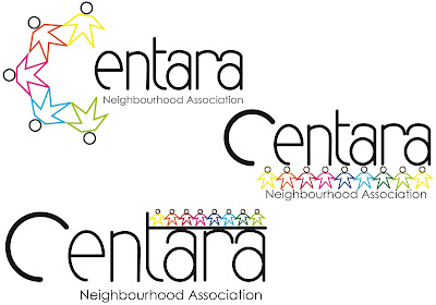
My fifth design I focused on people. I
designed some people that look flowers and holding hands. On the first logo I
used people to make a C shape to make it look new. The second logo I used them to
underline the Centara and over the strapline. The third logo I placed them on
the T straight to the end. I wasn’t sure about these logos because it looks
like children may have drawn the people. I drew some people with a colour
outline, filled with colour, black outline and filled black.


My last design is the same as my fifth design
but I used different people. I changed the flowers to look like a star shape.
This made it more professional and serious. I preferred these logos. I did same
thing to fifth design, colours outline, filling colours, filling colours with
black outline, black outline and filling black.


After the first presentation.
After receiving feedback from the client,
I’ve changed my first design and the last two designs. On my first design I
made the strapline shorter, by using “Central Neighbourhood Association”
instead of “Central Neighbourhood & Residential Association”.
And my two designs of people/community, I
changed less people on C.
After the second presentation.
After receiving feedback from the client, my
second design, people/community, doesn’t look less so I changed less people
into 5 on the C. And I’ve change the strapline by using “Neighbourhood
Association”. Then I made another design of people in colours with black
outline.

Few days later, we went over to the Cube in Corby, we looked around Cube building firstly, because it's recently built. Then went into the conference room for the announcement of their choice of logo design. Josh had been picked and i applauded for him. Well Done, Josh!
Comments
Post a Comment