Leaflet Design | Graphic Design
This live project, we have to design the leaflet for our local hospital, KGH (Kettering General Hospital), a leaflet full of information of Asthma.
So, I started doing development to design the layouts and
design the illustrating for the covers of leaflet.
I chose to use Indesign rather than using
OuarkXPress because I thought Indesign is easy to work on and also I don’t have Quark
on the desktop I currently use, so I have to use Indesign.
This background goes on both side. The front cover image is separate but is linked to the background, and also the field to link with.
I used the gradient mesh tool to create the shadows and highlight on their clothes and hair, to make them look quite realistic.
First thing I started to design the leaflet
is the layout on every page, then added the NHS logo and then write up from the
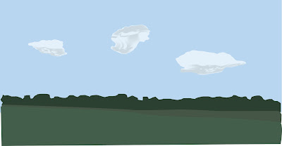
copy leaflet sheet. Then I used illustrator for the background, I planned to
use a field with pale blue sky and clouds and at the front of the background I
use two people, a child and a parent. The child and a parent are only on the
front page or page 1 of the leaflet and the rest of other pages are just the
field with sky and cloud as a background. On page 6 ‘This is my medication’, I
made the text boxes filling in white so they can read when write it.
There are some things I changed it when I
need it to improve are the text boxes on Safe Zone page, I made the filling
colour a bit darker than the sky from the background, I changed the arrows into
shorter so there are enough room for the text boxes and the background on page
5 and 6, I changed the field to same level as the front cover.
The client feedback that they want to changed
some bits, the front cover they said that the grass colour is too dark for
someone to write it, so I brighten it up. And on the Safe Zone page, they want
the text boxes more see through like on Green, Amber and Red Zone pages.
I am very pleased with my leaflet design, I
have improved the design and layout, better than before, in 1st
year.


Comments
Post a Comment