Tea Packaging Design Advertising | Graphic Design
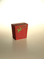
I did photography of my two packaging for
advertisement. I edited some bit in Photoshop; I clear the edges from Julian
Opie packaging and changed the brightness. Then I added the slogan, the green
colour are the part of Pickwick brand.
These are some photographs i shot to find the better look.


I worked around the photo in photoshop to use the brightness, highlight and adding the title and texts
I could improved my packaging needed to be
strong, I should use thicker card. As it would of photographed better. I
learned some from Photoshop to make shadows, reflections and clean some damaged
edges. I will develop these skills in the future.


Comments
Post a Comment