Tea Packaging Final Designs | Graphic Design

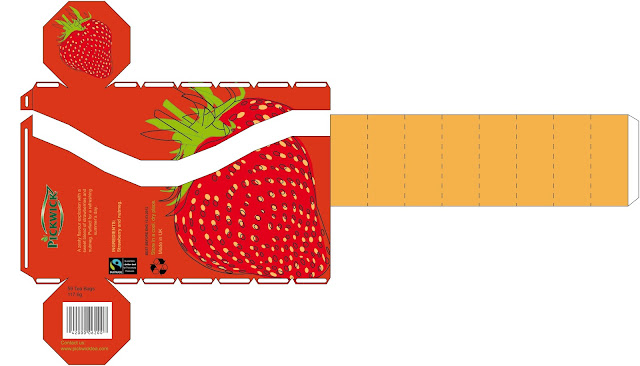
This is my finished packaging design post. I started to design tea packaging net in illustrator; first, I made an hexagon shape, the lid off. After I have done first net, I added the fruit image, I picked strawberry I made in illustrator, very soft colours and the outline turn a bit and in large scale, and then I picked different shade of red for background. Then I made second net with strawberry flavour and blueberry, blackberry and elderflower. I did the strawberry, same layout as first net, and then I did the berries with Julian Opie inspired style of myself. I have made the 2 ready-made for the jar, same design from second nets designs. Then I started to design the gift-box. It’s the same net as the second nets but it’s bigger. This time I used all of these fruits in illustrator and same design. I printed all designs in black and white and mock them up. There are some mistakes, 2 of the second nets design, I made the botto...
